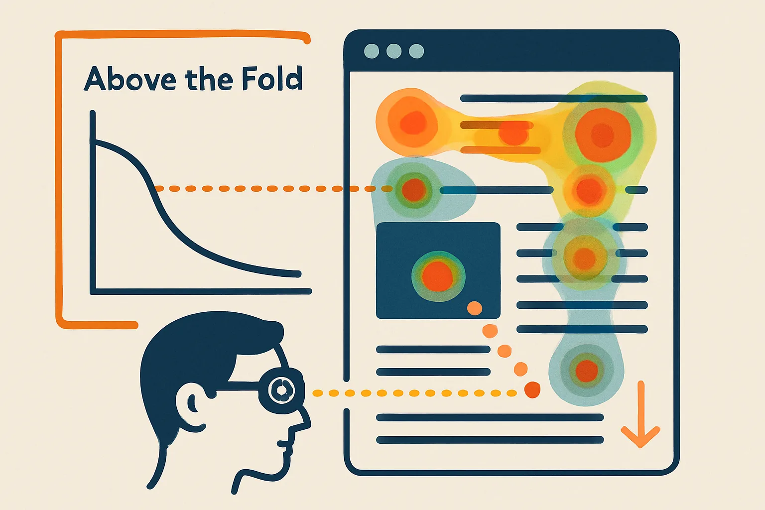
The Fold Myth and the Fold Reality
The "fold" — the point where content becomes visible only after scrolling — is one of the most discussed and most misunderstood concepts in web design. Some claim everything must be above the fold. Others say the fold is a myth. The evidence is more nuanced than either extreme.
The truth: the fold matters, but less for "users won't scroll" (they will) and more for "first impressions determine whether users engage." Our CRO team uses both eye tracking research and real scroll map data to guide layout decisions.
What Eye Tracking Research Shows
Eye tracking studies (Nielsen Norman Group, various academic research) consistently find:
The F-Pattern
For content-heavy pages (blog posts, product listings, search results), users tend to read in an F-pattern: full attention across the first line, less across the second line, then scanning down the left side only. Implications:
- Most important information belongs in the first line and the left side
- Right column content is largely ignored on content pages
- Subheadings and bullet points interrupt the F and draw the eye back to the right
The Spotted Pattern
On task-oriented pages (landing pages, checkout, product pages), users scan for specific elements rather than reading linearly. They're looking for the price, the CTA button, the product image. Eye fixations are scattered and concentrated on visually distinct elements.
Implication for landing pages: make your CTA visually distinct (color, size) and positioned where the scan naturally reaches.
Faces and Bodies Attract Attention
Photos of human faces — particularly eyes — attract significant eye fixation. Faces looking toward a CTA or product draw user attention in that direction. This is why testimonial photos with real faces outperform logos or faceless imagery.
What Scroll Map Data Shows
Scroll data from tools like Microsoft Clarity across large sample sizes consistently shows:
- 70–80% of users who scroll at all reach the first screen below the fold
- Engagement drops gradually with each screen, not a cliff at the fold
- The drop is sharpest in the first 2–3 screens, not uniform
- Mobile users scroll further than desktop users (proportionally to screen size)
- Natural visual "page endings" (heavy whitespace, footer-like elements) cause early stopping
Practical Above-the-Fold Principles
What Must Be Above the Fold
- Clear headline stating the core value proposition
- Visual context (product image, hero graphic, video) establishing what the page is about
- Primary CTA — at least one visible without scrolling
- Trust signal — at minimum one (star rating, client count, certification badge)
What Kills Above-the-Fold Performance
- Large hero images that push content down (especially on mobile)
- Auto-playing carousels/sliders — they fragment attention and delay seeing the value prop
- Cookie banners that occupy 30% of the viewport on mobile
- Chat widgets that overlap the CTA on mobile
- Navigation bars taller than 60px eating into visible content area
Testing Above-the-Fold Changes
Above-fold changes are high-impact and worth formal A/B testing:
- Test: headline above vs. below the hero image
- Test: hero with CTA overlay vs. hero below CTA section
- Test: video above fold vs. static image
- Test: navigation bar height (compact vs. full)
Instrument with GA4 scroll depth events and behavior analytics heatmaps to measure the impact of layout changes on engagement and conversion. Contact us for a layout CRO audit.
Need expert tracking setup?
Our Google Tag Manager experts have delivered 500+ tracking setups with a 98% success rate.
Get a Free Consultation →